Support Pixel UI
Our maintainers devote their time, effort, and heart to ensure Pixel UI keeps getting better. Support us by donating to our collective , code more with pixel ui


Opinionated and designed for daily use.
Accessible
Accessible Pixel Ul strictly follows WAI- ARIA standards for all components.
Themeable
Customize any part of our components to match your design needs.
Composable
Designed with composition in mind. Compose new components with ease.
Light and Dark Ul
Optimized for multiple color modes. Use light or dark, your choice.
Developer Experience
Guaranteed to boost your productivity when building your app or website.
Active Community
We're a team of active maintainers ready to help you whenever you need.
Your project can look as good as these! Check them out, get inspired!

We're dedicated to improving the experience and performance of pixel Ul.
Downloads per month
Github stars
Core contributors
Discord members
PIXEL HEROES


Echobind @echobind
Pixel Ul has become part of our default stack for React apps, and we're happy to help sponsor the project.
Pixel saves our team tons of time, is well designed and documented, has solid accessibility defaults, and looks great out of the box.

Ryan Florence @ryanflorence
People throw React component libraries and design systems at me regularly.
This might be the best one I've seen. The APs are simple but composable and the accessibility on the couple components I looked is complete.
Great work @thesegunadebayo, really inspiring work
Echobind @echobind
Pixel saves our team tons of time, is well designed and documented, has solid accessibility defaults, and looks great out of the box.
Echobind @echobind
Pixel Ul has become part of our default stack for React apps, and we're happy to help sponsor the project.
Pixel saves our team tons of time, is well designed and documented, has solid accessibility defaults, and looks great out of the box.
Guillermo Rauch @rauchg
Pixel Ul is glorious!
Dark mode support looks amazing and it is 100% built-in. I love the consistent use of focus styling and the subtle animation.
Great care for accessibility throughout. It is a guiding principle of the design system.
Last but not least, proudly made in u by @thesegunadebayo!
Nick Trabue @nicktrabue
@thesegunadebayo.I tried out pixel for the first time this weekend.
Easy to use.
Amazing Docs.
Highly customizable.
Thank you for your hard work!
Nick Trabue @nicktrabue
@thesegunadebayo.I tried out pixel for the first time this weekend.
Easy to use.
Amazing Docs.
Highly customizable.
Thank you for your hard work!
Aayush lyer @aayush
pixel is a fantastic component library that helps shape and accelerate the work we're doing with Twilio Paste.
Thank you @thesegunadebayo!

Sasa Sijak @ssijak
I find Pixel-Ul the best React component framework.
It provides just enough to get started, implements sensible defaults, but is also very extensible and customisable because it uses #styledsystem and @emotioncss.
Thanks @thesegunadebayo
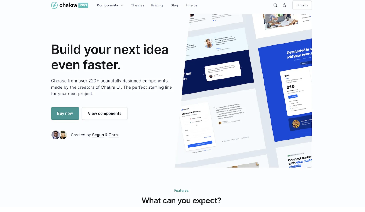
Beautiful and responsive React components to build your application or marketing pages quicker.

Want a Chakra UI core team member to speak at your next event? Invite us to create a memorable and engaging experience for your attendees.


